National Arts Council — Annual Report 2014
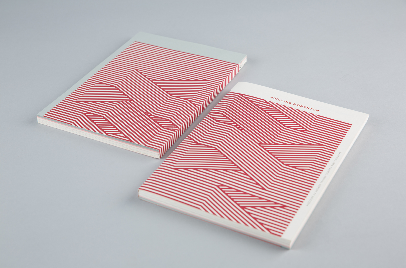
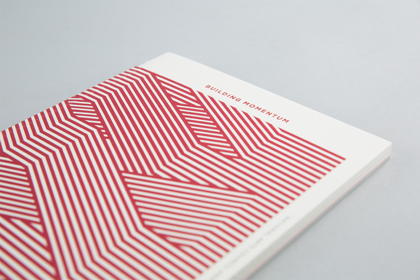
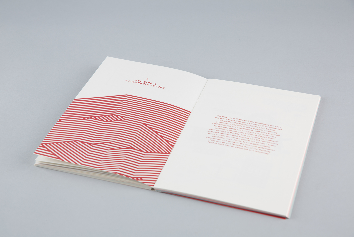
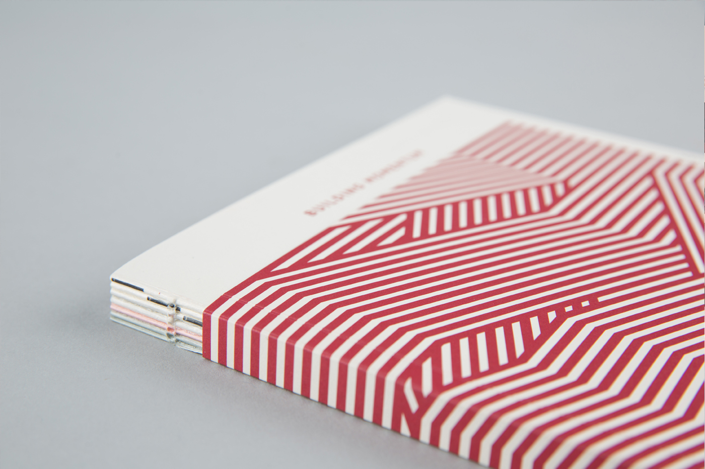
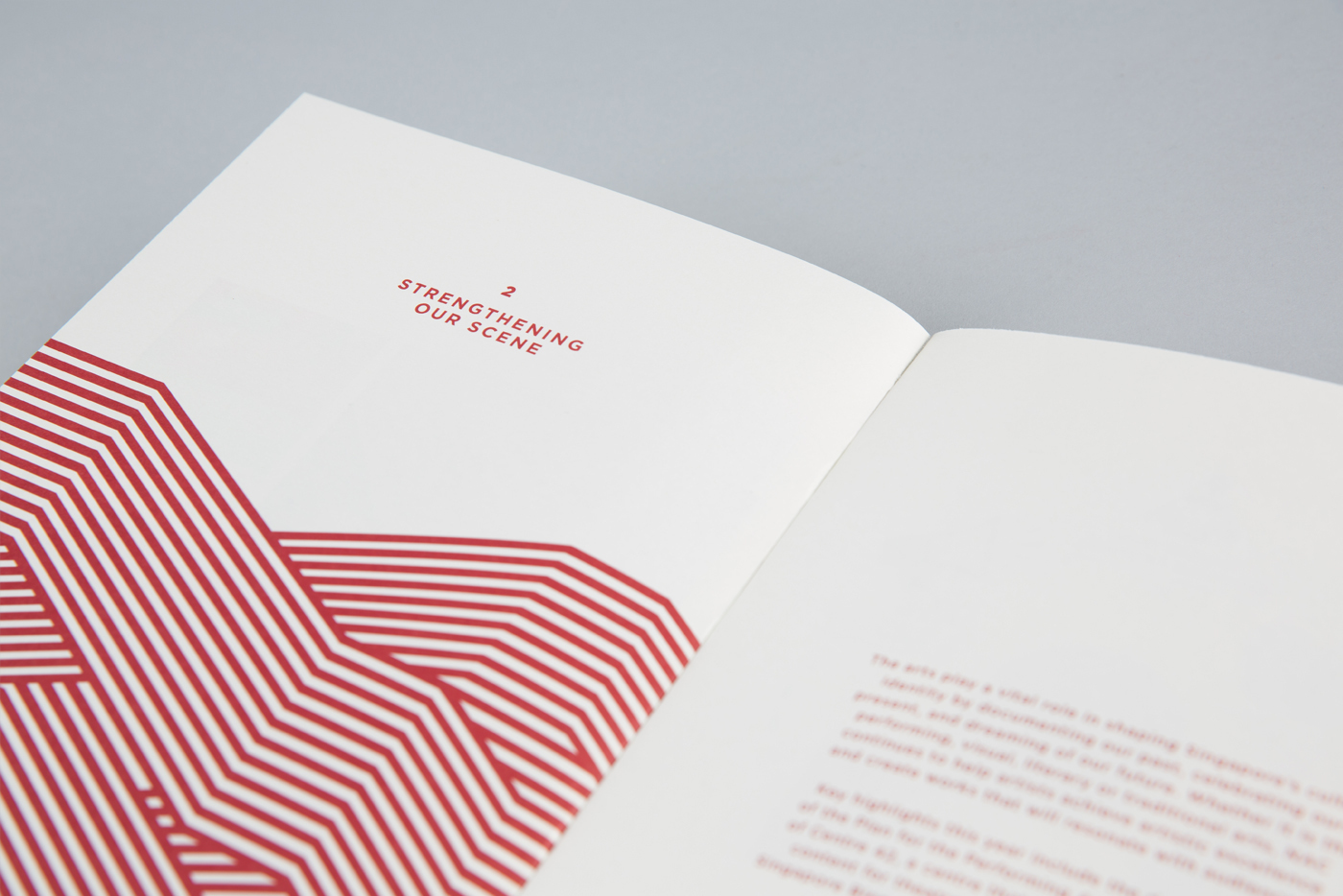
Annual Reports have a bad rap for being the driest and most uninspiring corporate collateral to design and digest. Most are briefly scanned through for the necessary information and hardly perceived as enjoyable reading material. We tackled this project with the purpose of challenging that notion with National Arts Council’s FY2013/2014 Annual Report.
The brief was simple: Make this Annual Report worth reading and keeping.
As the nation’s government agency dedicated to nurturing the arts in Singapore, NAC’s Annual Report had to be designed to represent the agency’s arts-centric, forward-thinking direction.
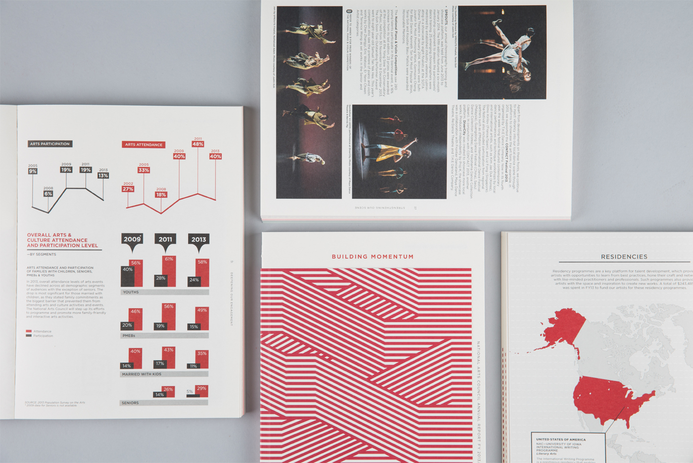
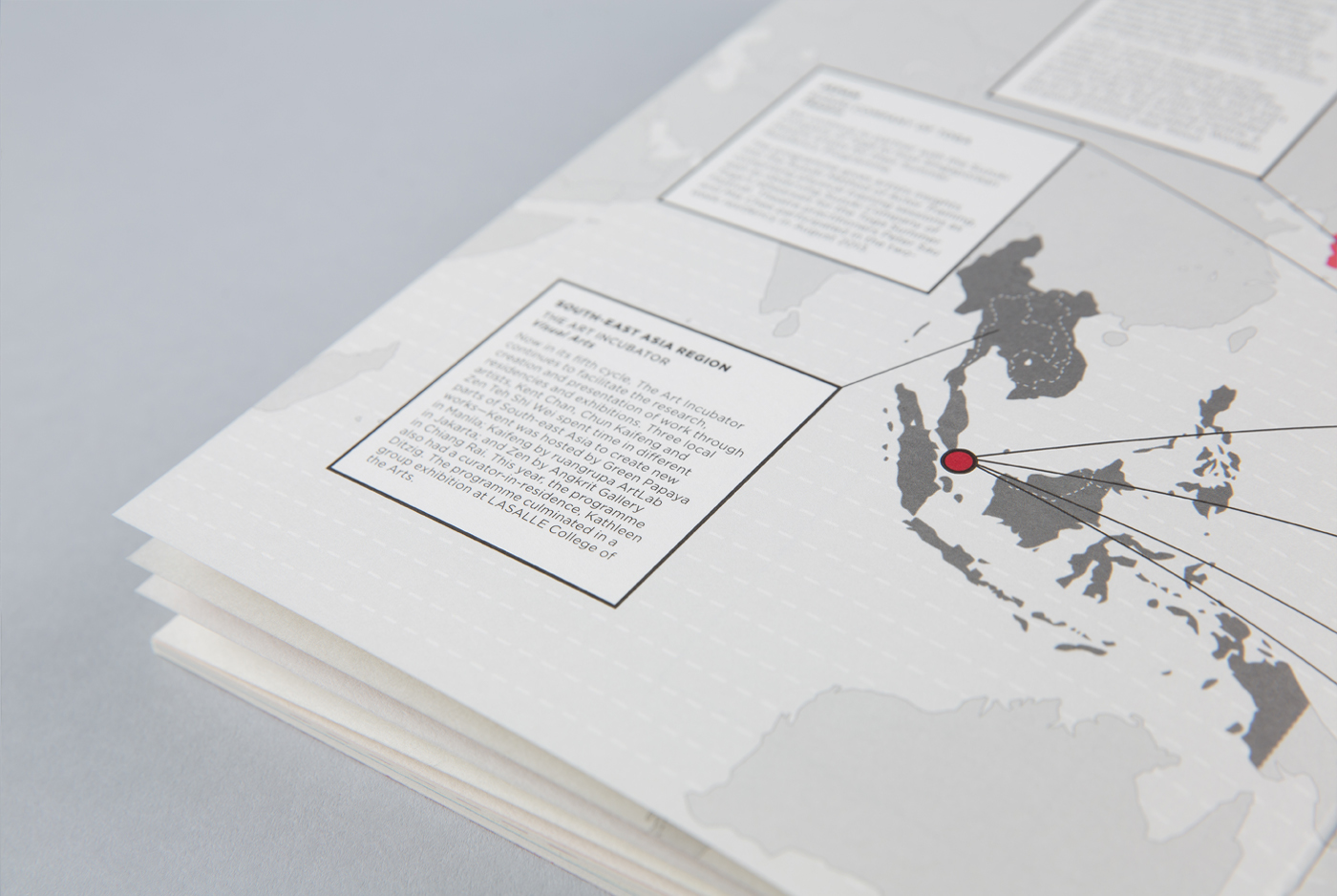
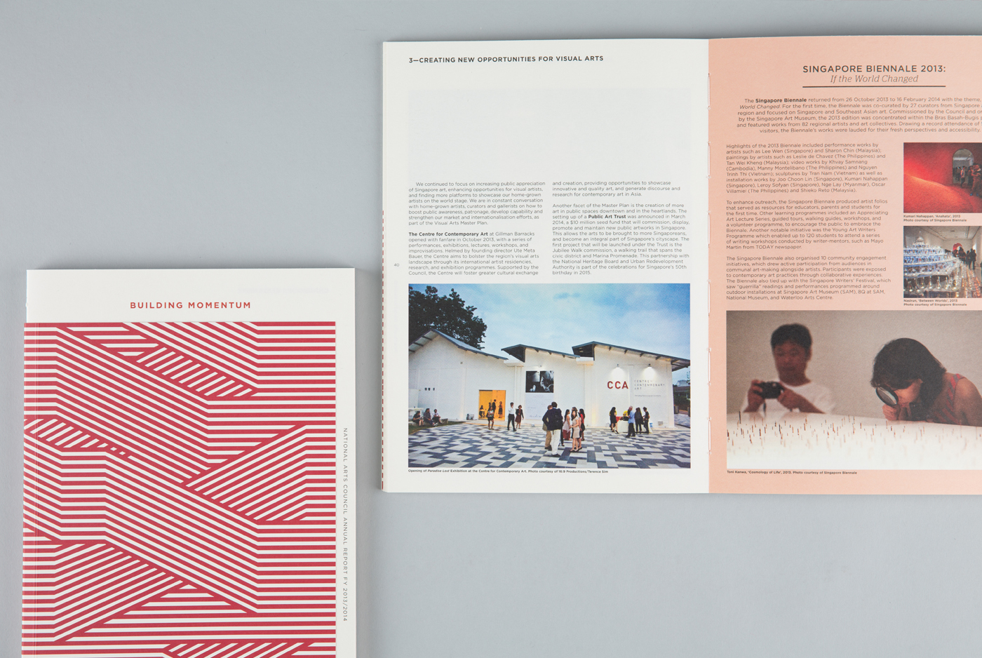
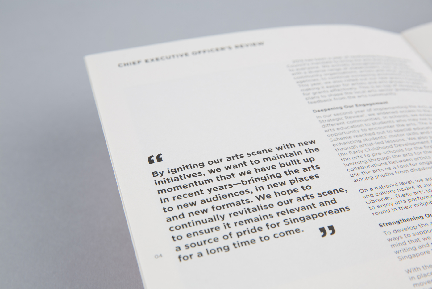
Strong typography is used throughout the report for clearer readability and accompanied by refreshed infographics to balance out hard information of figures and facts. The back pages were also given an interesting twist by using Pink Kishu Rainbow and Grey Kishu Rainbow paper stocks to lighten up the black and white financial information presented there.
